

Why Colors Matter in Branding
Colors aren’t just pretty decoration—they’re psychological triggers. Humans process visuals faster than text, and colors tap directly into emotions. The right palette can build trust, spark desire, or drive action before a single word is read. That’s why brands don’t choose colors randomly—they engineer them. In branding, color becomes an integral part of a brand’s identity system, appearing on logos, websites, packaging, and even social media feeds. When done right, a single color can make people instantly recognize a brand—think red for Coca-Cola or blue for FedEx.
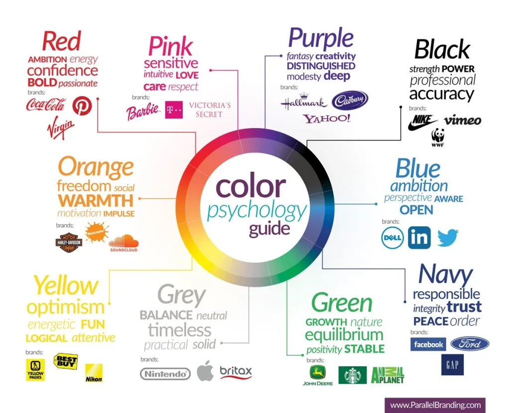
The Emotions Behind Common Brand Colors
Here’s how the most-used brand colors tend to influence human emotions:
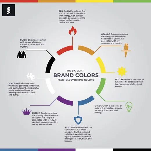
Red – Passion, urgency, excitement. Red grabs attention and stimulates appetite.
Blue—trust, security, calm. That’s why I rely on it.
Yellow—optimism, energy, warmth. pairs it with red to trigger hunger and happiness.
Green—growth, nature, and health—and use it to represent vitality and freshness.
Black—power, luxury, and authority—and use it to appear sleek and high-end.
Purple—creativity, royalty, imagination. and use purple to stand out as unique.
These associations aren’t random—they’ve been shaped by culture, biology, and marketing over decades.

The Science of Color and Consumer Behavior
According to color psychology research, color influences up to 90% of snap judgments about products. People decide whether they like or trust a brand almost instantly—often within 90 seconds—and color accounts for most of that impression.
For example, warm colors (red, orange, and yellow) trigger energy and urgency—great for call-to-action buttons or limited-time offers.
Cool colors (blue, green) build trust and reduce stress—perfect for tech companies or financial services. Neutral tones (black, white, and grey) add balance and sophistication, especially when paired with a strong accent color.
How to Choose Colors for Your Brand
Picking your brand colors isn’t just about what looks nice. It’s a strategic choice. Here’s a process that works:
1. Define your brand personality: fun and energetic or calm and professional? Your colors should reflect that.
2. Understand your audience. What emotional response do you want from them? Younger audiences might respond well to bold, vibrant palettes. Older audiences might prefer classic and minimal schemes.
3. Study competitors to determine what colors dominate your niche. You might choose to align (to blend in) or disrupt (to stand out).
4. Create a color hierarchy. Select a primary color (your signature), a secondary color (to support), and a neutral background color.
5. Test it in real contexts. Apply your colors to mockups: logos, websites, and social media posts. Colors can behave differently on-screen versus in print.
Color Consistency Builds Trust
Consistency is what makes color powerful. When people see the same color scheme across your website, social pages, packaging, and ads, it builds brand recall. Over time, your color becomes part of your brand’s mental real estate—and that’s priceless.
A consistent brand color system can increase brand recognition by up to 80%, according to marketing studies. That’s a huge edge in crowded markets.
Final Thoughts
Color isn’t just decoration—it’s strategy. If you want your brand to stand out and stick in people’s minds, you have to choose colors intentionally. When aligned with psychology, your color palette can influence emotions, guide decisions, and grow loyalty.
So next time you see a brand color you love, don’t just admire it. Decode it. There’s a reason behind it—and that same strategy can be the secret weapon that makes your brand unforgettable.